4. Squared
(15/11/22)


After spending last week burning I decided to try and make some progress on the other piece that I’ve been tinkering with and trying to iron out the direction of.
Up to this point I have been consciously trying to build up the texture of this piece until I find a direction for it to travel in. I have up to this point added texturing paste, inks, oil paints and spray adhesive that gives an interesting texture once sprayed on the surface. On this day I decided to go and buy some household paints from pound land and section off squares with masking tape to add some formal contrast to the free texturing that has occurred so far. (Pictures below)
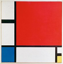
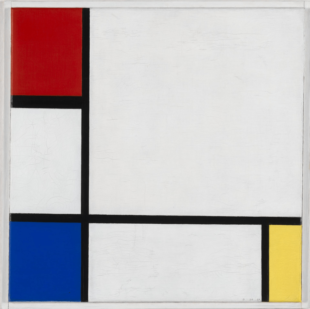
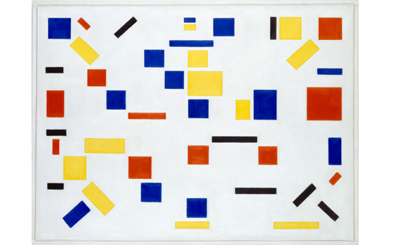
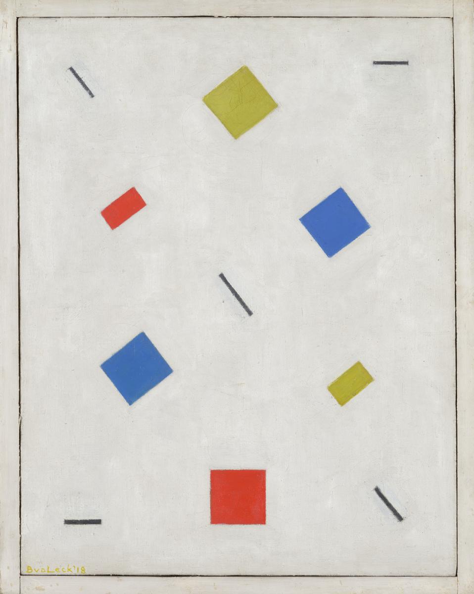
In the process of deciding to contrast the somewhat free flowing background of the pice by adding prominent geometric shapes I had been looking at works from the De Stijl movement. Artists work I looked at were works by Piet Mondrian and Bart Van Der Leck. I gravitated towards works by these artists because of the strong geometric method that appeared in the work. And because the painting I had been working on had no form to follow or likeness to project, I was free to implement the pure abstraction that De Stijl works often followed. But one element I sought to change was the colour pallet from black, white and primary colours because that colour scheme is heavily synonymous with the De Stijl movement and the colour scheme does not fit the vision I have for this piece so far. (De Stijl Works pictured below, first two by Piet Mondrian, second two by Bart Van Der Leck)
The structure of these pieces appears very methodical and intentional. In my painting I have carried this intentional placement, but because I made the decision to not measure perfect squares, rather mark them out with masking tape by eye and sometimes the aid of a metal bar, so the squares appear uneven in places, but this was my desired effect. From a distance the squares in my piece seem fine but because of the texture of the surface, as you get closer, you see paint bleeding from the edges where the masking tape as been. This differs from the hard lines in De Stijl paintings.
After adding these squares I was very pleased with the results as the texture showed through under the paints and it added yet another layer to the piece. I am still unsure of a fixed direction but a path seems to have been forged for at least a few steps, progress neverthe less. (Pictures below)
After adding these squares I want to find a way to insert similar vibrant colours to the other burnt piece I have made so far and I woudo like to add some more burnt elements to it. This is because I want all the pieces I produce for this project to have a tie between them so they feel a part of a collection.
I began priming some wooden panels I brought in today, so these will hopefully materialise into something in the coming weeks. (Pictures Below)
More Later
Lots Of Love
John Hancock X


Comments
Post a Comment